
Re-branding for
Low Hedgeley
Visual identity / logo development / brand guidelines / asset creation / iconography
Brief: Create a refreshed brand identity that modernises Low Hedgeley.
Low Hedgeley is a family run business that is being taken over by the next generation. They pride themselves on having a hands-on approach which is what I wanted to reflect in the brand identity. The type-writer font nods to the heritage whilst the hand-drawn cow reflects their organic approach to farming. Their pride and joy are their Galloway cows which are unique to their farm and for their meat which is why I wanted to hero them in their new brand world.

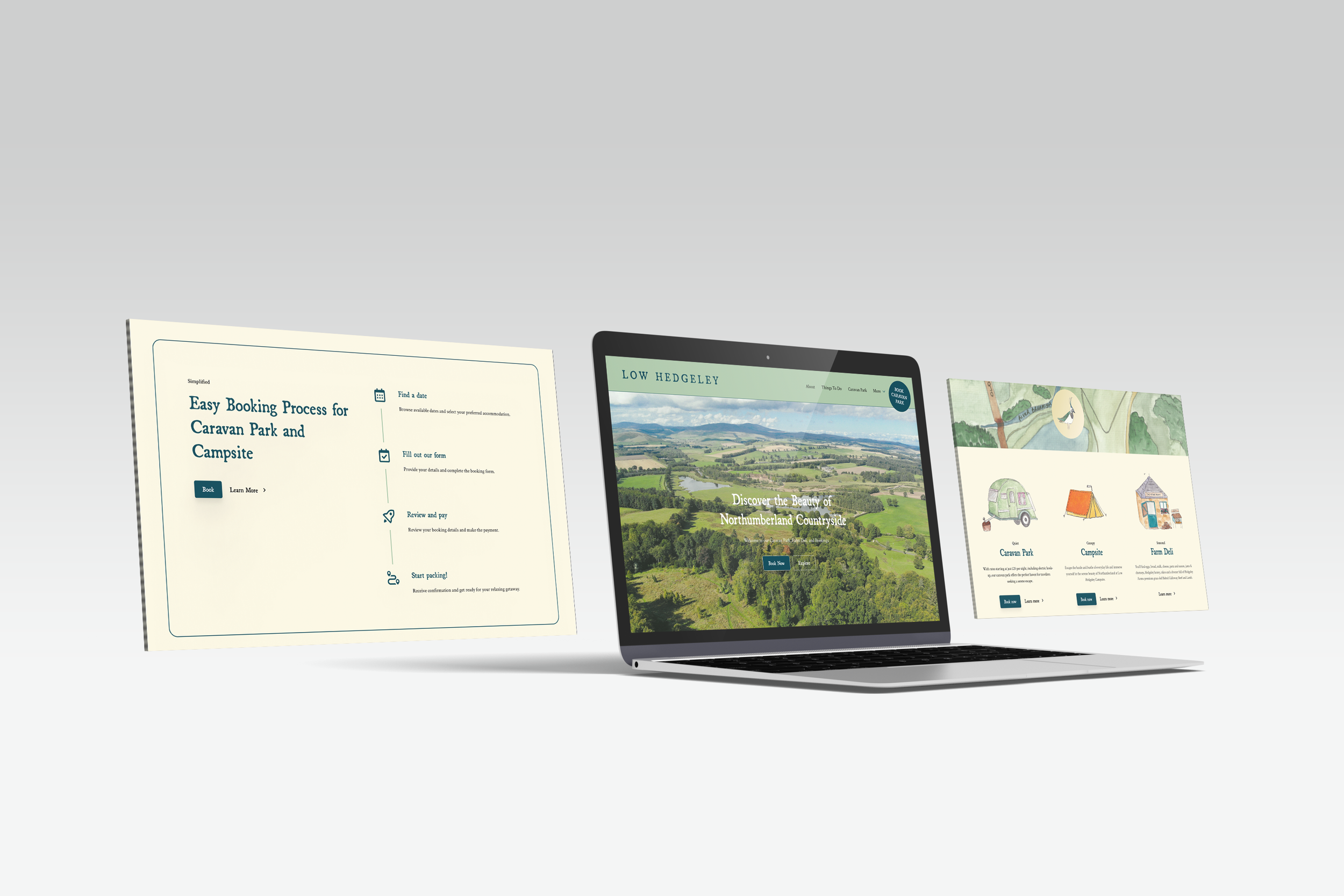


This hand drawn map is to be used on Low Hedgeley’s homepage. Each element was drawn seperately then placed on the map so that i can be animated when users view it online. It shows off their land and how much campers can hope to explore.
WORKING PROCESS
