
Life Supplies:
Re-brand
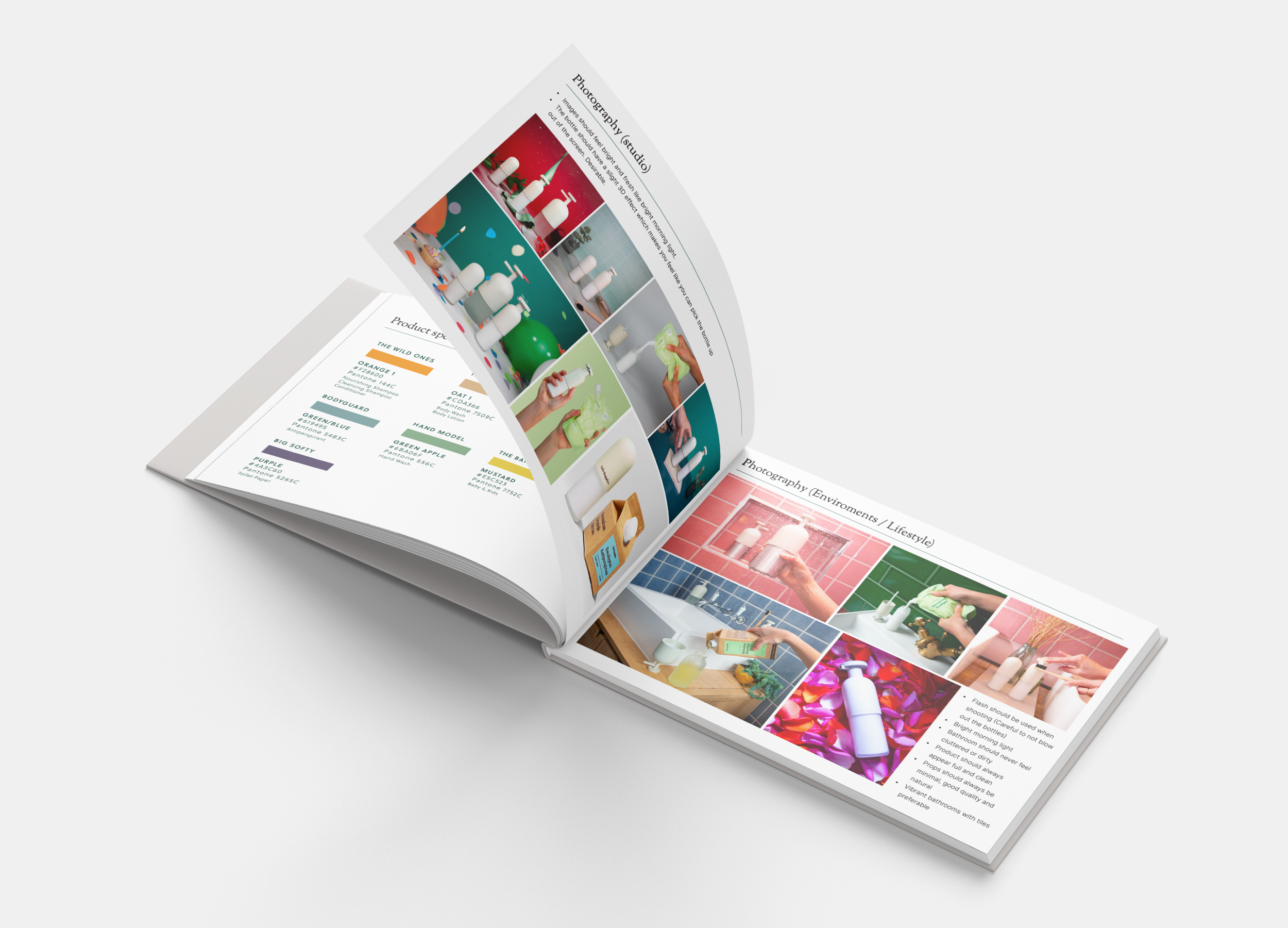
Art direction / brand guidelines / packaging development
Brief: Re-design the brand Life Supplies for a ‘D2C’ female audience aged between 25-35. The brand should appear exciting and aspirational.
We wanted to bring a bit more energy into the brand as the minimalist design of the bottles felt quite cold and unapproachable. I decided to bring some colour into the brand which reflected each products ‘hero’ ingredient, ie shampoo uses oranges. This was reflected as a background colour on each product card as well as in the packaging. I also introduced a serif font as our primary font making the brand feel more elevated and premium.


WORKING PROGRESS
